



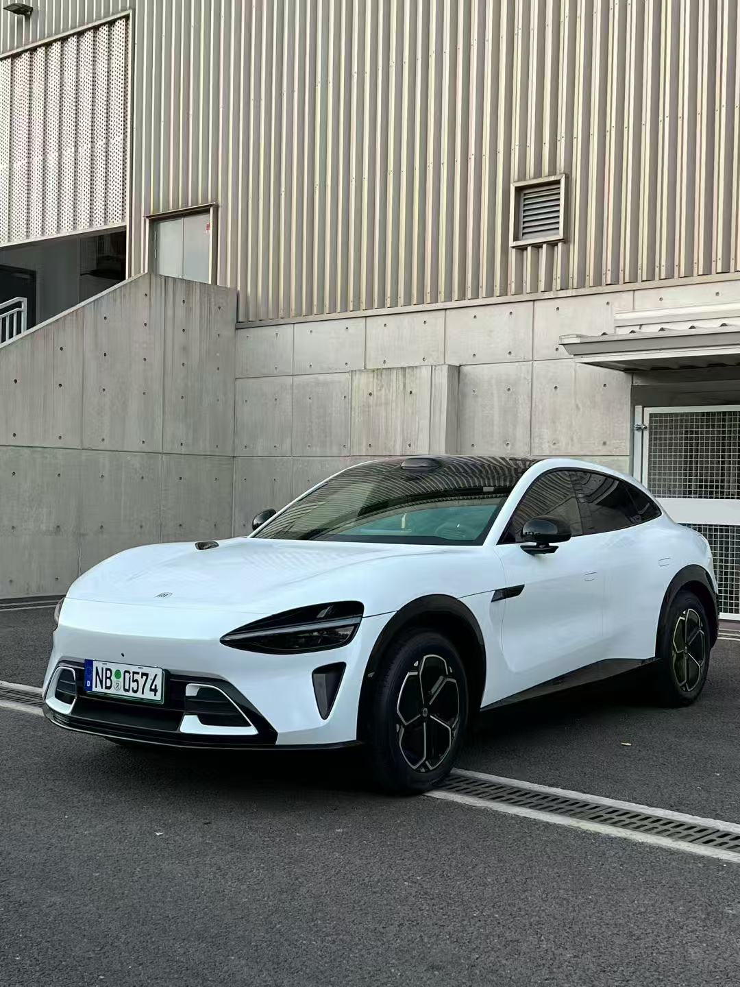


Color is one of the fastest ways to change a vehicle’s personality. As drivers look ahead to 2027, the conversation is moving beyond “bright versus neutral” toward a more nuanced question: how can a color feel expressive without looking temporary, and how can a familiar shade feel new through tone, finish, and light?
Axalta’s 2026–2027 Global Automotive Color Trends report offers a useful framework. Released in October 2026 for vehicle manufacturers and designers, it identifies four design directions: softened pastels, deeper reds and browns, colors influenced by both technology and nature, and familiar neutrals enhanced by subtle effects. The company says the forecasts are intended to shape automotive design over the next three to five years. These are original-equipment coating trends, not a ranking of aftermarket wrap sales. Still, they can help wrap shoppers build a thoughtful color shortlist for 2027.
Here is how to translate those four directions into practical wrap decisions—without assuming that a forecast shade is available in every film range or will look exactly the same as an automotive paint.
1. Soft color, with a more polished finish
Axalta calls its first direction “Beyond Quiet: Strength in Softness.” The idea is a more sophisticated evolution of pastel-inspired hues: colors that feel calm and optimistic, yet still have enough presence to look deliberate on a modern vehicle.
For a wrap, this does not have to mean a pale pastel that dominates the whole car. It could be a muted blue, soft lilac, warm blush, low-saturation green, or another gentle tone with a refined finish. The important choice is the balance between brightness and restraint. A softer color can make a large SUV feel less imposing; on a compact coupe, it can create a distinctive look without relying on a highly saturated shade.
How to make a soft color feel intentional
Look at the car’s existing details before choosing the exact hue. Black trim and dark wheels can add definition around a light body color. Silver or brushed-metal details can make the overall palette feel cooler and more technical. Warm bronze accents can move it in a softer, more lifestyle-oriented direction. These are visual starting points, not fixed rules: the exact color temperature of a film and the vehicle’s trim will affect the result.
Finish matters too. A gloss surface can increase reflections and make a pale color feel brighter. Satin can soften the highlight while keeping some sheen. Matte changes the way light spreads across the panel and may make the color feel more understated. Compare samples of the same or similar hue in more than one finish before deciding that you like—or dislike—the color itself.
Soft shades can also be a good candidate for a partial wrap. A roof, mirror caps, or a contrasting panel can introduce color while preserving much of the original paint. If you prefer a full wrap, ask an installer to show a larger sample against the vehicle rather than judging a tiny swatch in a showroom.
2. Deeper reds and browns bring warmth and character
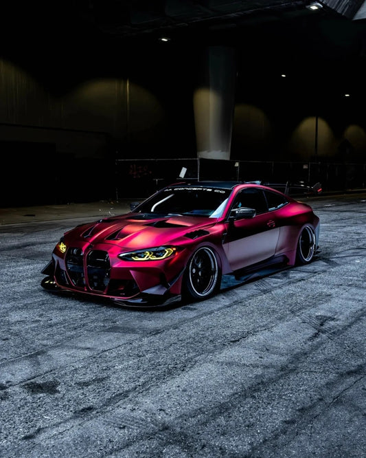
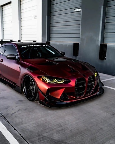
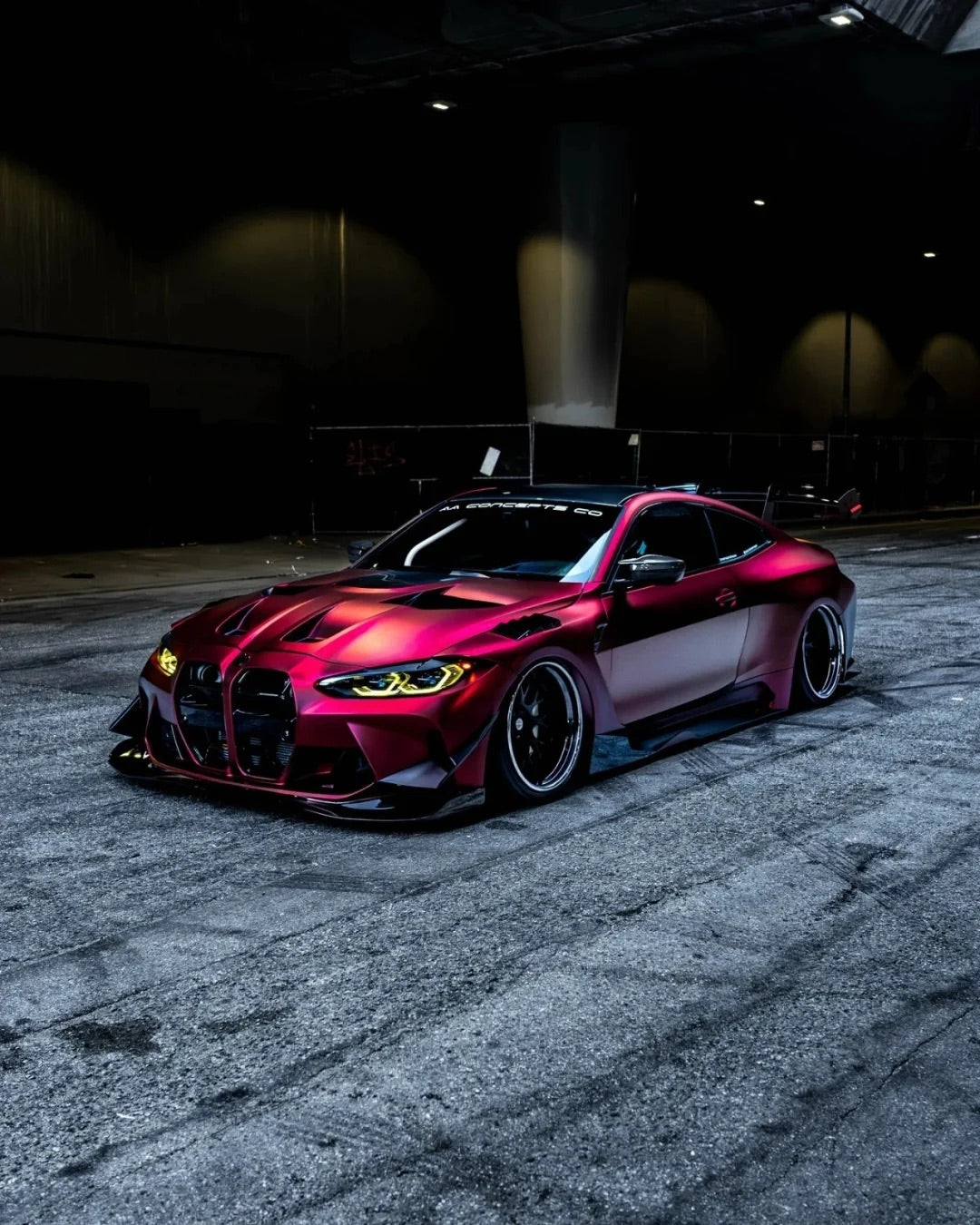
The second direction, “Luxury 2.0: Beyond the Pomp & Into the Soul,” focuses on richer reds and browns. Axalta describes these tones through ideas such as authenticity, craftsmanship, and emotional depth. The direction is less about a loud, flat red and more about colors that reveal variation in the light.
In wrap terms, this can mean considering burgundy, ruby, wine, oxblood, copper-brown, or a deep earthy neutral. Those labels are not standardized across manufacturers, so do not assume two products with similar names will look alike. One “ruby” can read as a clear red in daylight and almost black in shade; another can have a brighter or more purple undertone.
Choose your red by the light it catches
Start by deciding how visible you want the car to be. A vivid red announces itself from a distance. A darker ruby may look more restrained at first and reveal its color as the sun moves across the body. A brown-red or copper tone can feel warmer and more distinctive, especially when paired with neutral trim.
Ask for the sample outdoors in direct sunlight, open shade, and overcast conditions if possible. Artificial shop lighting can make deep reds look brighter or more saturated than they will appear on the road. Look at the sample from several angles and curve it gently over a body line. That will give you a better sense of how reflections and shadows change the color.
Also consider the vehicle’s shape. Strong creases and sculpted fenders create areas of highlight and shadow that can make a deep color feel more dimensional. A flatter-bodied vehicle may show a more consistent tone across large panels. There is no universal “best” red for a particular body style, but the way light travels over the design should be part of the choice.
3. Nature and technology meet in color
Axalta’s “Deep Dive: Just Beyond Depth” explores colors that sit between natural influence and technological character. The report connects this direction with qualities such as trust, stability, and innovation, and with broader changes in mobility. For wrap shoppers, it suggests looking at blues, blue-greens, mineral tones, deep teals, and greens that feel crisp or complex rather than purely earthy.
This is a broad design direction, not a recommendation for one exact shade. It can include a dark ocean blue with a quiet metallic effect, a teal that shifts between blue and green, or a cool mineral tone that looks clean without becoming a plain gray. Some finishes may appear more technical because of their reflective particles or color effects; others may feel closer to nature because their undertone is muted.
Use contrast to set the mood
Pair a blue-green wrap with black trim for a crisp, contemporary appearance. Add silver or cool metallic details if you want the palette to feel more precise and restrained. If the color leans green, warmer accents can make it feel more organic. As always, test the combination with the actual vehicle: nearby colors influence how a wrap reads.
For two-tone designs, establish a clear hierarchy. Choose one main body color, then use a second tone on a defined area such as the roof or lower panels. Too many competing colors can make a sophisticated palette feel busy. A subtle difference in finish—such as gloss body panels with satin accents—may be enough to create separation without adding another hue.
Color-shift and metallic effects deserve special attention. The name may sound dramatic, but the amount of visible shift depends on lighting, viewing angle, panel orientation, and the specific film. Ask for a sample card or a demonstration piece, and confirm whether the film is designed for full-vehicle installation. Product lines can vary in recommended application and care requirements.
4. Neutrals evolve instead of disappearing
The fourth direction, “Beyond Ordinary: The Power of Essentials,” recognizes that white, black, gray, and silver continue to anchor automotive color choices. The forecast’s point is that these familiar colors can gain distinction through nuanced undertones, surface effects, and finish—not that neutral colors are going away.
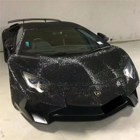
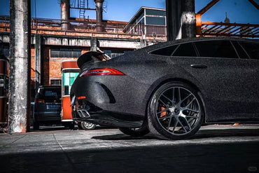
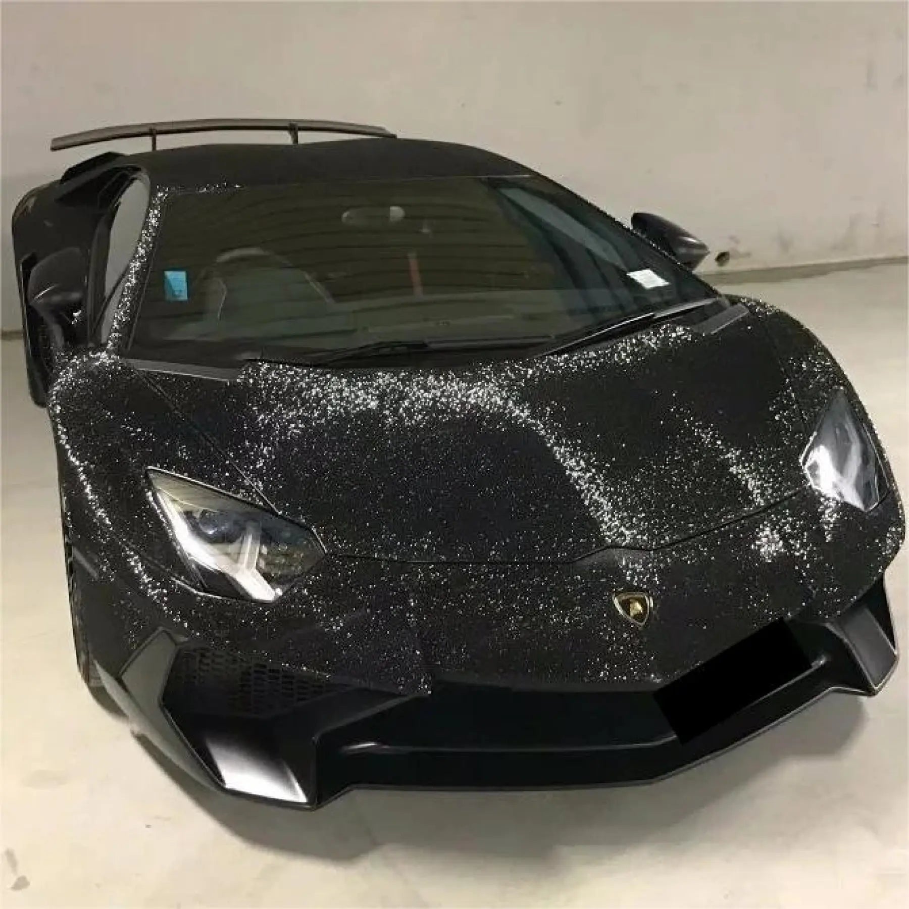
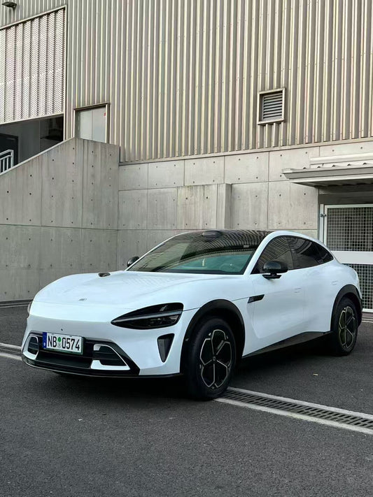
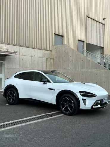
That makes this direction especially useful if you want a change that feels considered but not dramatically colorful. A gray with a blue undertone can feel cooler than a warm stone gray. A creamy white can look softer than a sharp, bright white. A black with metallic depth can appear different from a flat black, while a satin finish can make a familiar neutral feel more contemporary.
Look past the basic color name
When comparing neutrals, ask what undertone the film has and how the finish affects it. Place the sample beside the car’s original paint, window trim, wheels, and badges. A gray that looks neutral by itself may read blue beside a warm silver wheel. A white film can look creamy next to a cool white factory finish. Seeing the sample in context prevents surprises.
Neutrals also make a useful base for accents. If you want a restrained body color with a personal touch, test a contrasting roof, mirror caps, stripe, or graphic. Keep accent colors connected to details already on the car, such as brake calipers, interior trim, or wheel finish. This creates a more coherent design than selecting accents in isolation.
How to turn a trend report into a real wrap plan
A forecast can start the conversation, but a successful wrap decision needs a few practical checks. Use this short process before placing an order or booking an installation.
Step 1: Describe the mood, not just the color
Write down three words you want the vehicle to communicate: refined, playful, understated, bold, outdoors-inspired, or something else. This gives you a filter when browsing hundreds of color names. Two colors may both be “blue,” but one could feel calm and classic while the other looks energetic and futuristic.
Step 2: Pick a shortlist across finish types
Choose two or three related colors and, where available, compare finishes. For example, compare a deep red in gloss and satin, or a blue-green in gloss and matte. This helps separate your preference for hue from your preference for reflection. It is easy to reject a color when the real issue is the finish—or to choose a finish based on a shade that you later decide is too bright.
Step 3: View samples in the settings where you use the car
Check samples outdoors at midday, in shade, and near dusk. If the vehicle spends time in a garage or under street lighting, view it there as well. Color perception changes with surrounding light and neighboring surfaces. Screens are useful for narrowing options, but they are not a reliable final color reference.
Step 4: Discuss the installation details
Ask the installer how the chosen film handles deep recesses, curved panels, edges, and seams on your specific model. Confirm whether door jambs will remain the original color and whether trim or badges need to be removed. Ask for the manufacturer’s product information, care instructions, and removal guidance. Installation quality, surface preparation, and aftercare all contribute to the final appearance.
Step 5: Decide whether the wrap should be full or partial
A full wrap creates the strongest transformation and covers more of the vehicle’s exterior. A partial wrap can test a trend with less visual commitment or combine the original paint with a new accent. Before choosing, ask how visible panel transitions will be and how the design will look with the vehicle’s doors open, hatch raised, or roof viewed from above.
What a 2027 forecast can—and cannot—tell you
Axalta’s report is made for automotive manufacturers and design teams and looks ahead over several years. It is not a measurement of vinyl-wrap purchases, a guarantee of future consumer preferences, or a list of products available through every installer. Its four directions are best used as a lens: softer expressions, warmer depth, nature-and-technology combinations, and refreshed essentials.
That distinction matters because automotive paint and wrap film are different materials. A coating forecast can inspire the general feeling of a wrap—such as jewel-like red, muted softness, or a nuanced neutral—but it cannot promise an exact vinyl match. Film colors, names, availability, and finishes vary across brands and markets. Always make the final decision with a physical film sample and current product information.
One useful way to read the report is not as a prediction of a single winning color, but as permission to be more specific. Instead of asking only “Should I choose red or gray?”, ask whether you want a red that feels bright or deep, or a gray that looks clean or warm. Instead of “Do I want green?”, consider whether you prefer an earthy shade or one with a cooler, more technical character. Those refinements can make a wrap feel personal, even when it begins with a familiar color family.
Four 2027 directions, one personal choice
The most useful takeaway from Axalta’s 2026–2027 report is the range it presents. A 2027-inspired wrap could be a quiet pastel with a polished surface, a rich red or brown that reveals depth, a blue-green that balances natural and technical cues, or a neutral distinguished by undertone and finish. Each path offers a different way to make a car feel more individual.
None of these directions has to dictate the final design. Choose the color that works with your vehicle, your surroundings, and how much attention you want it to draw. Compare real samples, discuss installation details with a qualified shop, and use trend forecasts as inspiration rather than instructions.
Which 2027 direction would you choose: soft color, deep red, nature-inspired blue-green, or a reimagined neutral?
Read Axalta’s 2026–2027 Global Automotive Color Trends announcement. For a specific ruby-red paint direction, see Axalta’s 2027 Color of the Year, Redefined.
